Tailored data visuals: Aligning insights with your business needs
Every business has unique data visualization requirements. When dealing with large datasets, it’s easy to get lost in a sea of information. Instead of presenting an overwhelming list of terms, structuring and displaying data in an intuitive way enhances usability. Looker Studio provides standard chart types such as bar charts, line charts, pie charts, maps, and tables, all fully customizable to suit your reporting needs.
Managing PPC campaigns effectively relies on having the right insights at the right time. With a wealth of data from Google Ads and competitive sources, navigating through raw information can be overwhelming.
That’s where Looker Studio streamlines this process.
By integrating Adthena’s market data into Looker Studio, businesses can transform complex datasets into clear, actionable reports. Looker Studio makes it easier to create impactful dashboards that highlight the most important PPC metrics, making it possible for everyone to quickly access and act on insights.
In this blog, Emily White, Customer Success Manager at Adthena, explains how Looker Studio enhances Adthena’s data to help businesses craft effective reports that boost PPC performance.
Place features from multiple areas of Adthena in one view for quick and easy consumption.
1. Structuring reports for maximum impact
When it comes to reporting on your Google Ads data, structuring your reports effectively is key to turning data into clear, actionable insights. Whether you’re analyzing daily performance or looking at longer-term trends, how you present your data can make all the difference in understanding where you stand and where you need to focus.
Tailoring reports to suit your specific needs will vary depending on their purpose. Here are some ways to structure reports for maximum impact:
- Weekly digest reports: A quick ‘pulse check’ of your market position across all campaigns, offering a high-level view of performance to help you stay on track.
- Quarterly Business Reviews: Focus on creating visuals that benchmark performance, making it easier to spot trends.
- Competitive analysis: If tracking ranking changes is a priority, comparisons can provide visibility into performance shifts and competitor activity over time.
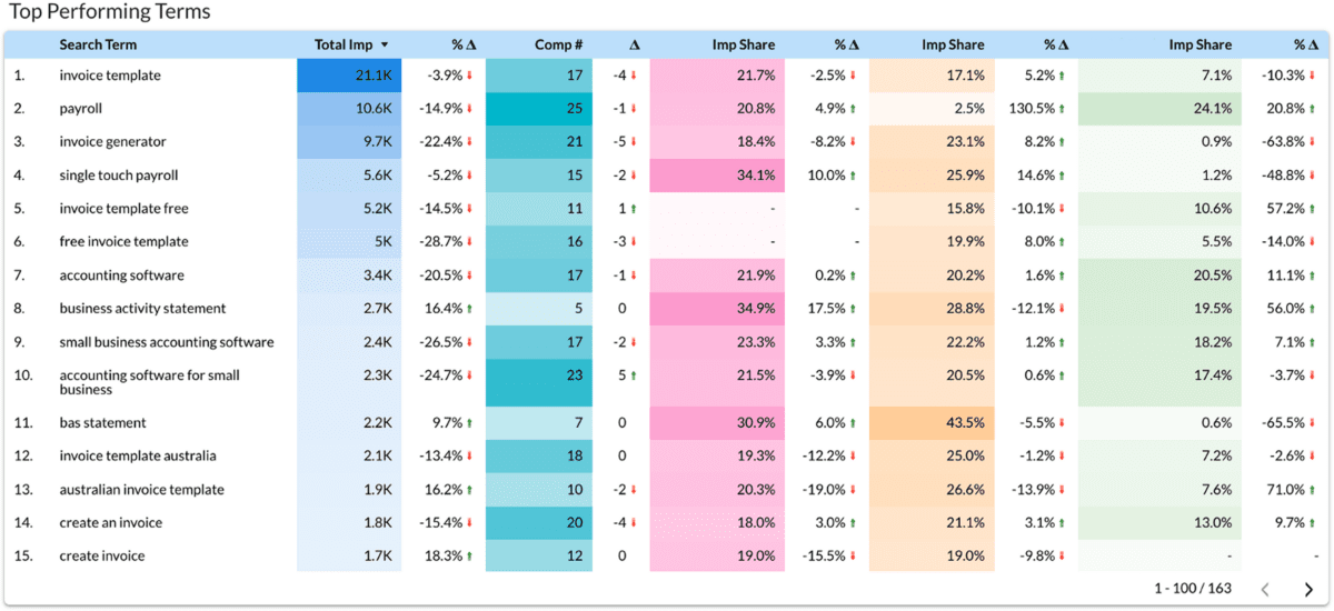
An example of a weekly digest report in Looker.
2. Ensuring actionable insights
Turning raw data into insights that drive action isn’t just about collecting numbers; it’s about selecting the right data and making it easy to act on.
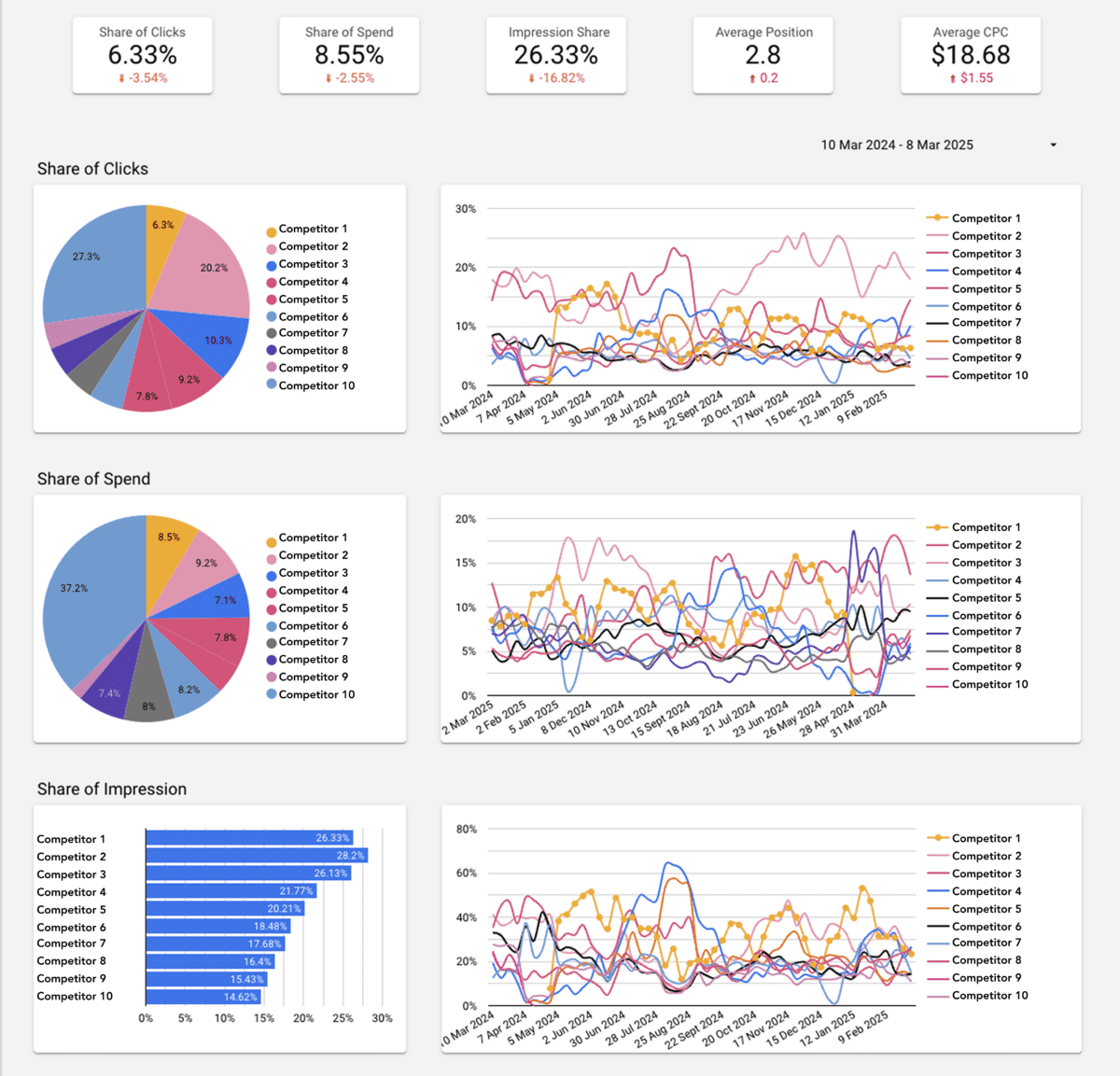
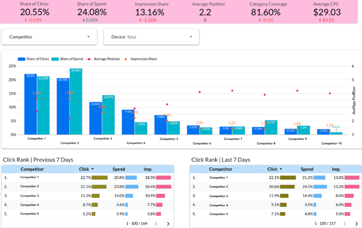
Highlighting competitor performance, such as shifts in click share or changes in the competitive landscape, empowers you to respond quickly and stay ahead. For example, understanding how competitors are performing across key metrics, like share of clicks and impressions, allows you to refine your PPC strategies.
And here’s the game-changer: With Google pulling Auction Insights data, many advertisers are losing crucial competitive visibility. But with Adthena’s Share of Spend integrated directly into your Google Ads reports, you get a fresh perspective on how your competitors are distributing their budgets across key terms. This insight lets you assess your own investment strategies relative to competitors.
Plus, with Looker Studio, this process becomes even more powerful. You can seamlessly pull Adthena’s competitive intelligence into your dashboards, creating customized views that highlight the metrics that matter most. Whether you’re optimizing campaigns or delivering reports to leadership, Looker Studio makes sure your insights are always up to scratch.
A Looker dashboard with a competitor performance breakdown.
3. Managing large data sets efficiently
When working with large datasets, it’s essential to focus on clarity and usability. Instead of overwhelming dashboards with excessive data, carefully selecting which insights to include ensures reports remain impactful.
Key tips for managing large data sets efficiently:
- Separate data across multiple pages to improve navigation and makes it easier for users to find relevant information.
- Prioritize the most valuable insights to help make reports actionable and ensure that key takeaways stand out.
- Avoid displaying everything at once to reduce complexity and ensure reports are easy to interpret.
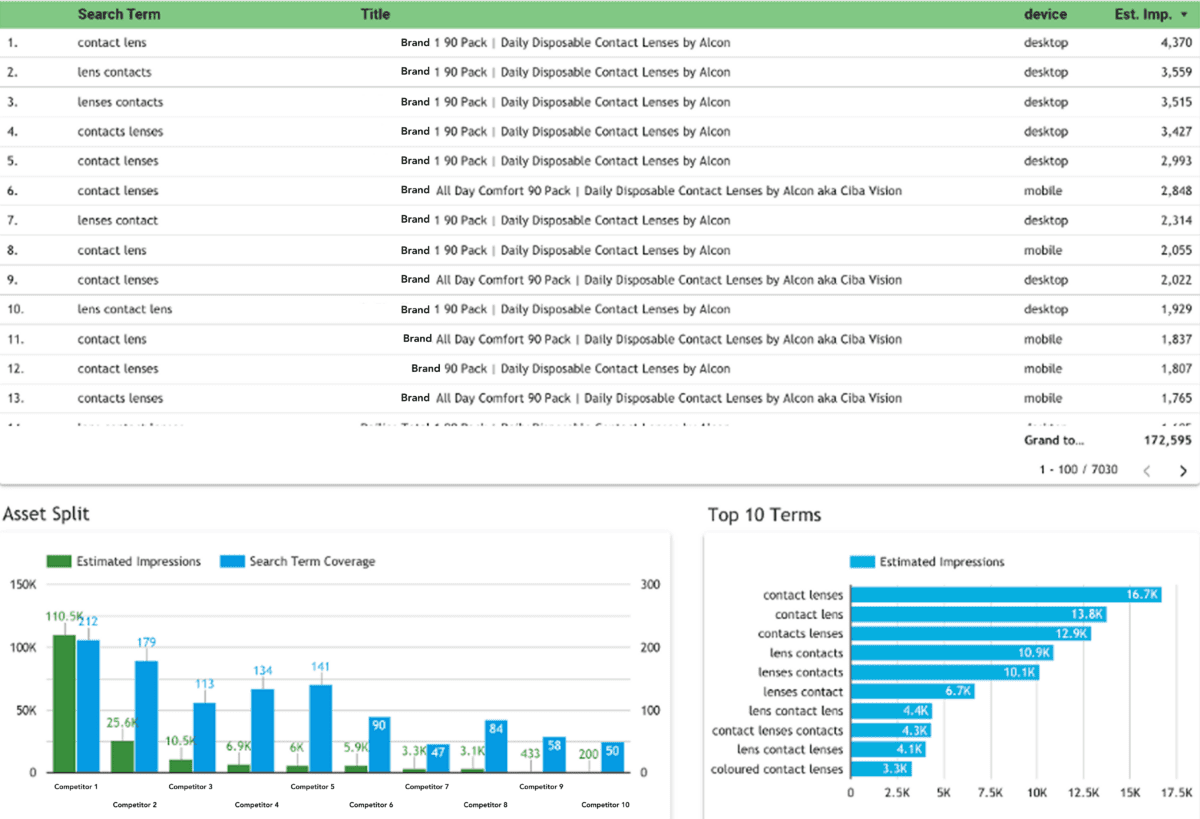
A best-practice Looker dashboard showcasing segmented data pages.
Best practices for impactful reporting
Effective reports start with understanding what matters most to your business. By asking the right questions, you can tailor data visuals to meet your needs and objectives. Whether you’re aiming to create comprehensive reports showcasing your performance and competitive landscape on Google Ads or similar platforms, it’s important to focus on three key questions:
- Does this dashboard make it easier to understand my data?
- Does this dashboard make it faster to access my data?
- Is it actually answering my key questions?
- Does this dashboard make it easier to understand my data? The goal is to ensure that the visualizations make complex data simpler to interpret.
- Does this dashboard make it faster to access my data? Time is of the essence when you need to act on insights quickly. Streamlined, intuitive reports allow you to access key metrics with ease, saving time and boosting efficiency.
- Is it actually answering my key questions? Ask yourself: Is this dashboard providing actionable insights that directly answer my questions? Effective reports should address the specific goals and decisions at hand.
Our PPC search experts are by your side, ensuring your Looker dashboards and reports are fully customized to your needs. We’re here to help you uncover actionable insights and get the most out of your data, every step of the way.
Ready to get more actionable insights? Request a demo to learn how Adthena can enhance your reporting.