In today’s fast-paced world, it is becoming increasingly challenging for businesses to keep up with the complexities happening across their search landscape. Traditional reporting methods may not suffice to understand the trends and derive insights needed to stay ahead of the competition. That’s where Adthena’s MyAnalytics comes in. It’s a new offering designed to solve this challenge by providing custom PPC analytics and tailored data stories that are unique to each customer.
With MyAnalytics, you can access a growing library of data stories designed specifically to address your unique challenges. The good news is that it’s all streamlined within the Adthena platform.
We’re now giving you full control over how you access, discover, and take action on your MyAnalytics dashboards.
MyAnalytics Catalog is a new feature within MyAnalytics, it’s designed to empower users by providing a comprehensive catalog of reports. This feature allows users to browse, subscribe to, and manage reports directly within the Adthena application, enhancing users PPC analytical capabilities and allowing them to have more control over their MyAnalytics dashboard experience.
Easily find which dashboards are relevant to you and your business. Check out some of our premium dashboards below.
Premium Dashboards
Conductor Integration Dashboard
This dashboard provides visibility of both Conductor’s and Adthena’s data, with combined metrics and KPIs to support SEO and SEM use cases simultaneously. You can use it to get a holistic view of how your paid and organic activity works together, and quickly review cross-channel recommendations for improvement.
Seasonal Events
The Seasonal Event dashboard analyzes trends during seasonal events. A heatmap shows performance for the top 10 domains by your chosen metric across search terms. Daily performance heatmaps reveal competitor performance compared to daily and monthly averages. You can filter trends and ad impressions by competitor group, allowing you to compare strategies and optimize campaigns for seasonal success. Monitor which competitors are using phrases you want to track in their ad copy and get visibility on the saturation of promotional messaging in the market.
Absolute Demand
This dashboard dives into a chosen metric, showing its absolute value compared to search trends and competitor data. Visualizations track how the metric changes over time alongside search volume. You can also see metric performance for specific search terms. A competitor filter lets you analyze against chosen rivals or the entire market, providing a comprehensive view of your metric’s performance.
Share of Demand
This dashboard tracks a chosen metric alongside search trends and competitor performance. It shows how the metric changes over time compared to search volume. You can also see how the metric performs for different search terms. The competitor section lets you focus on specific rivals or view the broader market. This way, you can analyze your metric’s performance in detail.
Adthena also offers standard dashboards. It equips you with custom analytics and tailored data narratives unique to your business challenges. With Adthena’s competitive advantage in the market and the flexibility, efficiency, and ease of use offered by MyAnalytics, you can stay ahead of the competition by making informed decisions based on the insights derived from the data. You and your team can manage up to three on your own. Take a look at our broad, free offering below.
Standard Dashboards
Competitor Movement Dashboard
Get a detailed overview of market performance with a range of trends and share analysis. This dashboard allows you to compare week-on-week performance, identify the biggest movers, and gain an overview of different categories compared with your other top competitors. You have complete control and can select custom start and end dates, locations, search terms, and a whole lot more.
Market Dashboard Group Analysis
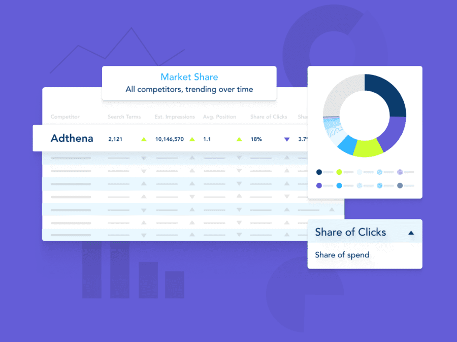
This dashboard analyzes how different search terms impact your performance. It shows the overall contribution of each term group and lets you see trends over time. Heatmaps provide a detailed view, and tooltips offer specific metrics. You can also compare competitor contributions for up to 3 rivals, visualized in pie and bar charts.
Market Dashboard Location Analysis
This dashboard analyzes how locations impact a search term group’s performance. See total contribution by location and trends over time. Heatmaps provide details, and tooltips offer specific metrics. You can compare competitor contributions for up to 3 rivals, visualized in pie and bar charts.
Market Dashboard Top Domains Breakdown
This dashboard analyzes the top 10 competitors for a location and search term group. See their click share, trends, and key metrics in a heatmap. Track their impression share over time and identify the biggest movers in performance between two periods.
Market Dynamics
This dashboard gives you an executive summary of the search landscape. Having a bird’s eye view of your landscape, including key movements over the last two weeks, can only increase your chances of market success. It will also identify the competitors that have moved the most, so you can keep track of who’s in the lead at any given time.
Year on Year
Uncover the search demand for each category and gain insights into the impression share for you and your top competitors over a selected period. This dashboard allows you to view the data over multiple years or compare specific months across different years, enabling you to spot patterns and make strategic decisions.
Top Domains Dashboard
This dashboard helps you compare ad spend efficiency for top domains within a search term group. A trend chart shows how each domain performs over time. Hovering over the chart reveals details. A table provides a deeper dive into spend efficiency and performance metrics by date, ad type, and device, allowing you to identify the most efficient domains for your campaigns.
Yearly Overview
This dashboard allows clients to gain a high-level overview of the performance and movements of the client domain and their competitors over the last 12 months with additional YoY views. It gives a combined view of multiple STGs as well as a deeper dive into individual STGs.
Competitor Intelligence
This dashboard gives you an overview of your top competitor’s behavior across all groups. It also allows you to choose competitors to do a deep dive into their movements.
Location Dashboard
This dashboard optimizes ad spend across locations. It shows how efficient your spend is for each location within a search term group over time. Hovering over the chart reveals details for each location. A table breaks down spend efficiency and performance metrics by date, ad type, and device, allowing you to pinpoint areas for improvement in different areas.
Group Dashboard
This dashboard helps optimize ad spend. It shows how efficient your spend is for each search term group over time. Hovering over the chart reveals details for each group. A table breaks down spend efficiency and performance metrics by date, ad type, and device, allowing you to pinpoint areas for improvement.
Period Performance
This dashboard tracks your domain’s performance against competitors over various periods. See weekly, monthly, and yearly trends with comparisons to previous periods. Analyze click and spend share across search terms and domains. Explore year-over-year and week-over-week changes. A KPI table summarizes performance for all domains, and a final chart highlights the biggest movers in the last week.
Ad Type Search Terms
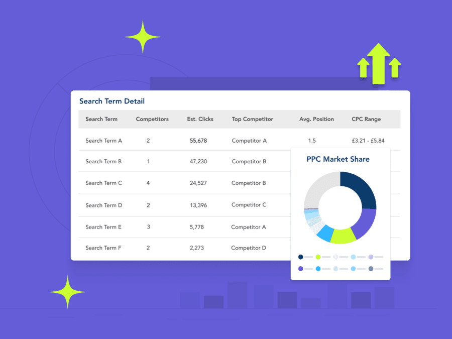
This dashboard analyzes search terms within a group for the past month. It reveals top and bottom performers, average ad position, and estimated clicks for each term and ad type. Hovering over visuals provides details on specific terms. A final heatmap summarizes all terms and their performance metrics by ad type, offering a comprehensive view.
Ad Type Group Summary
This dashboard analyzes ad performance within your chosen search terms. It breaks down clicks by ad type (percentage, average position) and estimates total clicks for each type over the past 30 days. A market share visualization lets you see click volume and market share for each search term group, helping you identify the most effective ad types.
Market Dynamics
This dashboard tracks weekly trends for your chosen metric, highlighting the biggest movers in the market. Visualizations show how the top competitors perform each week. A table compares performance across different time periods. Additionally, it identifies the top five competitors with the most significant increases and decreases, along with a trend visualization of these biggest movers.
Location Summary
This dashboard analyzes a domain’s performance within a specific search term group, across various locations. See market share for clicks and spend, domain position by location, and metric heatmaps for locations and top competitors. Trend graphs and tooltips offer insights into location-specific performance.
Location Deep Dive
This dashboard lets you analyze location-specific performance for a domain across chosen search terms. See market share for clicks and spend, domain position, and metric heatmaps for terms and top competitors. Trend graphs and tooltips offer deeper insights into campaign performance.
Geographic Insights
This dashboard analyzes a domain’s performance across locations. The first map shows the domain’s rank in each chosen location. A second table details rank and share metrics for all locations. Finally, another map visualizes the chosen metric’s performance by location, letting you see how it varies across different areas.
Group Performance Summary
This dashboard summarizes performance for your chosen search terms. The group performance summary shows your standing in each term. A trend graph lets you see how a chosen metric changes over time. Hovering over the graph reveals details for specific points in time.
Device and Ad Type Review
This dashboard lets you compare ad performance across device and ad type. See how your market share stacks up against competitors with heatmaps and bar charts. Analyze click share, average position, and spend efficiency by competitor. Hover over visuals for additional details and market trends.
Local Service Ads
This dashboard provides visibility of the average frequency and average number of Local Service Ads versus other ad types over the selected period and search term group. It also provides the top 20 competitors for local service ads by frequency. You can easily identify areas of opportunity for LSA expansion or identify local competitors less present on text ads.
What are the key benefits of MyAnalytics?
Streamlined Access
MyAnalytics eliminates the need for external tools like Tableau. We’ve centralized all the benefits, including core analytics, advisor features, and BI reports, within the Adthena platform. This consolidation simplifies your experience and enables faster and more efficient delivery of custom dashboards.
Unparalleled Flexibility
We’ve heard your feedback about the limitations of the reporting and insights available in our core analytics. MyAnalytics addresses this challenge by offering even greater flexibility and efficiency. It overcomes the limitations of our current BI offering, providing you with the insights you need to navigate the complexities of the search landscape.
Empowered Decision-Making
MyAnalytics empowers different personas within your organization to leverage its capabilities effectively. You’ll benefit from the customized analytics and tailored data, enabling informed decision-making at every level.
Want to learn more?
Interested in getting access to a premium dashboard? Get in touch with a search consultant.


